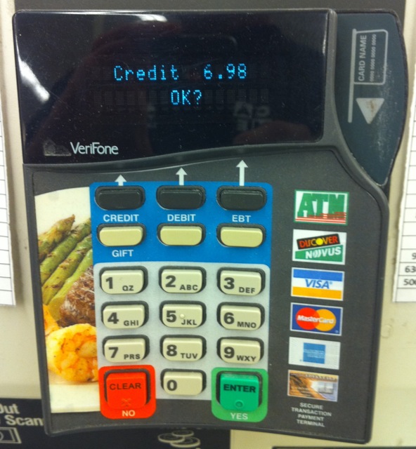
Self checkout systems at supermarkets and hardware stores are becoming ubiquitous. They all deliver a horrible user experience. I was in Lucky recently and after swiping my credit card I was prompted “Credit 6.98 OK?”. It took me three three tries to get it right (I know – I’m slow). But here’s what went through my mind:
- The Debit button’s arrow it pointing toward the “OK?” on the screen. I’ll press the Debit button. Fail.
- Are they asking me, “Debit or Credit?”. I press the Credit button. Fail.
- I press the green Enter button. Success!
But I have to ask myself:
- Why is “OK?” the approval phrase? The button they want me to press is labeled Enter AND Yes. Why didn’t they use either of those words?
- In addition to allowing the Enter button to be a valid input, is there any reason not to have Debit and/or Credit be a valid button too?
- And they couldn’t be bothered to add a dollar sign to the display? To wit “Credit $6.98”
